Visual IdentityThe Radiant
The Radiant
Ecosystem.
A visual metaphor for a living, breathing ecosystem of human potential. Anchored in Connection, Network, and Growth.
01
Unity in Diversity
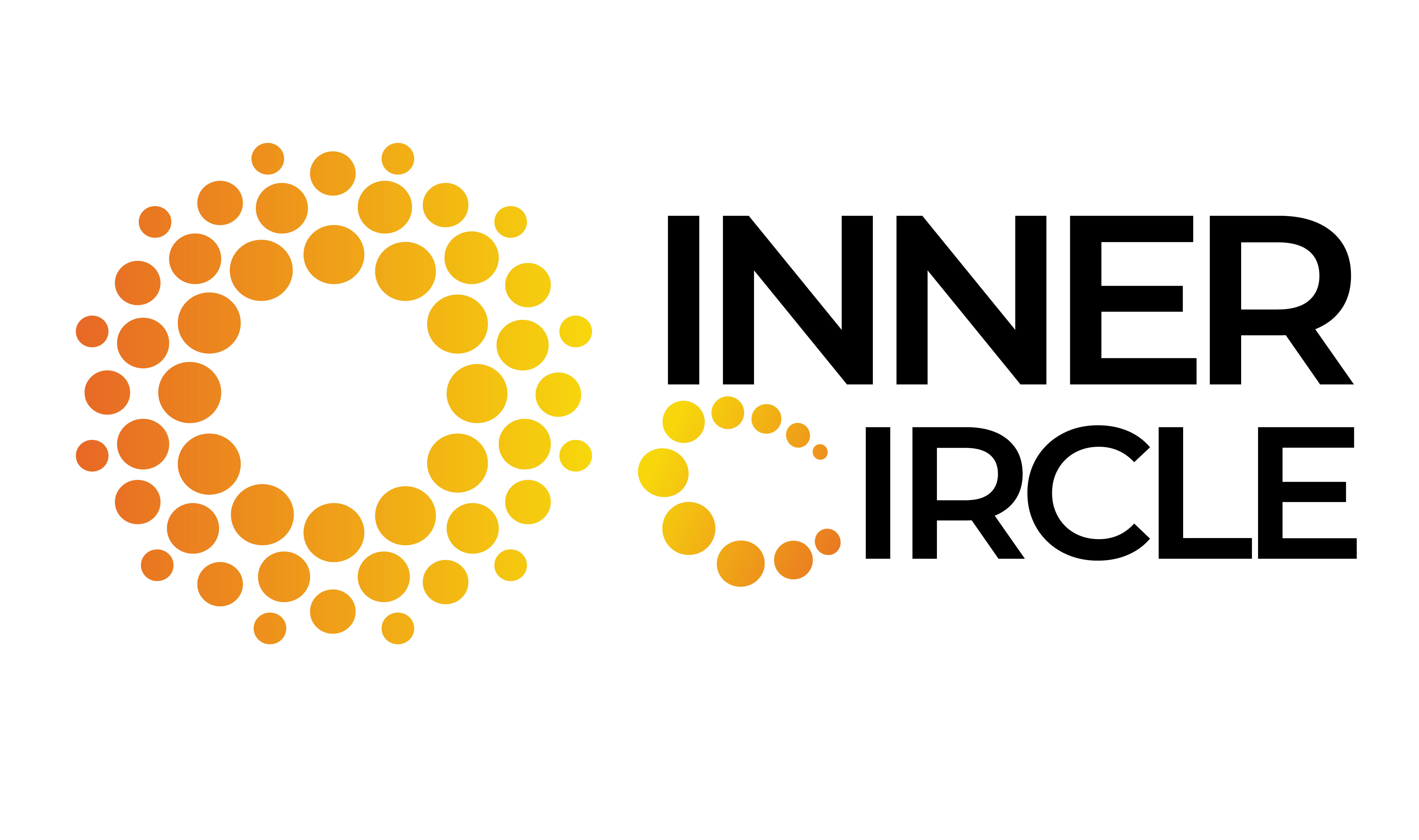
Distinct spheres unite to form a perfect circle. This represents Community: unique individuals drawn together by purpose, belonging to something greater.
02
Energy & Growth
The gradient shifts from deep orange (passion) to sunburst yellow (clarity). This symbolizes Growth—the "light bulb moments" when ideas are shared.
03
The Integrated 'C'
The letter 'C' is built from the same particles as the icon, proving that the network IS the brand. Inner Circle is built by its people.
Official Assets

Primary Mark
For light backgrounds & print

Reversed Mark
For dark backgrounds & screens
Golden Rules
To preserve the integrity of the Inner Circle brand, please adhere to these non-negotiables.
Maintain clear space (1x logo width) around the mark.
Do not add drop shadows, outlines, or glow effects.
Do not rotate the logo mark independently of the text.
Do not change the colors of the gradient dots.